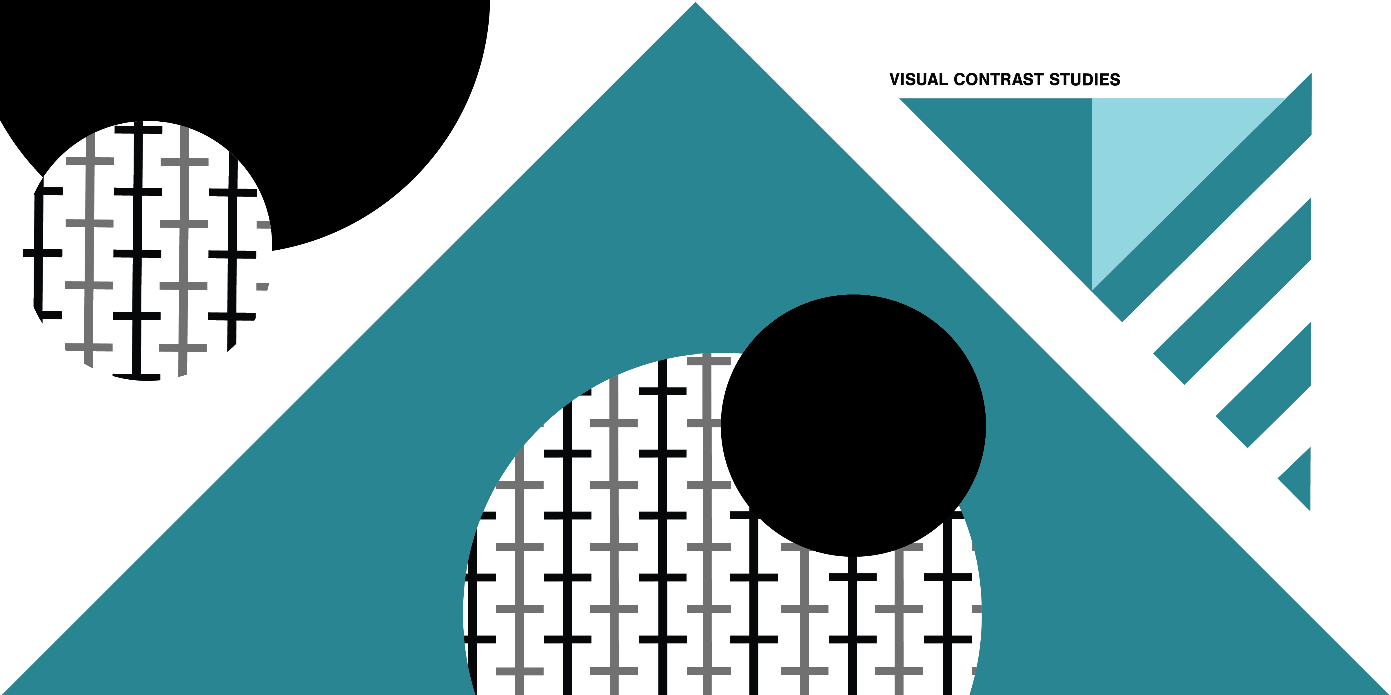
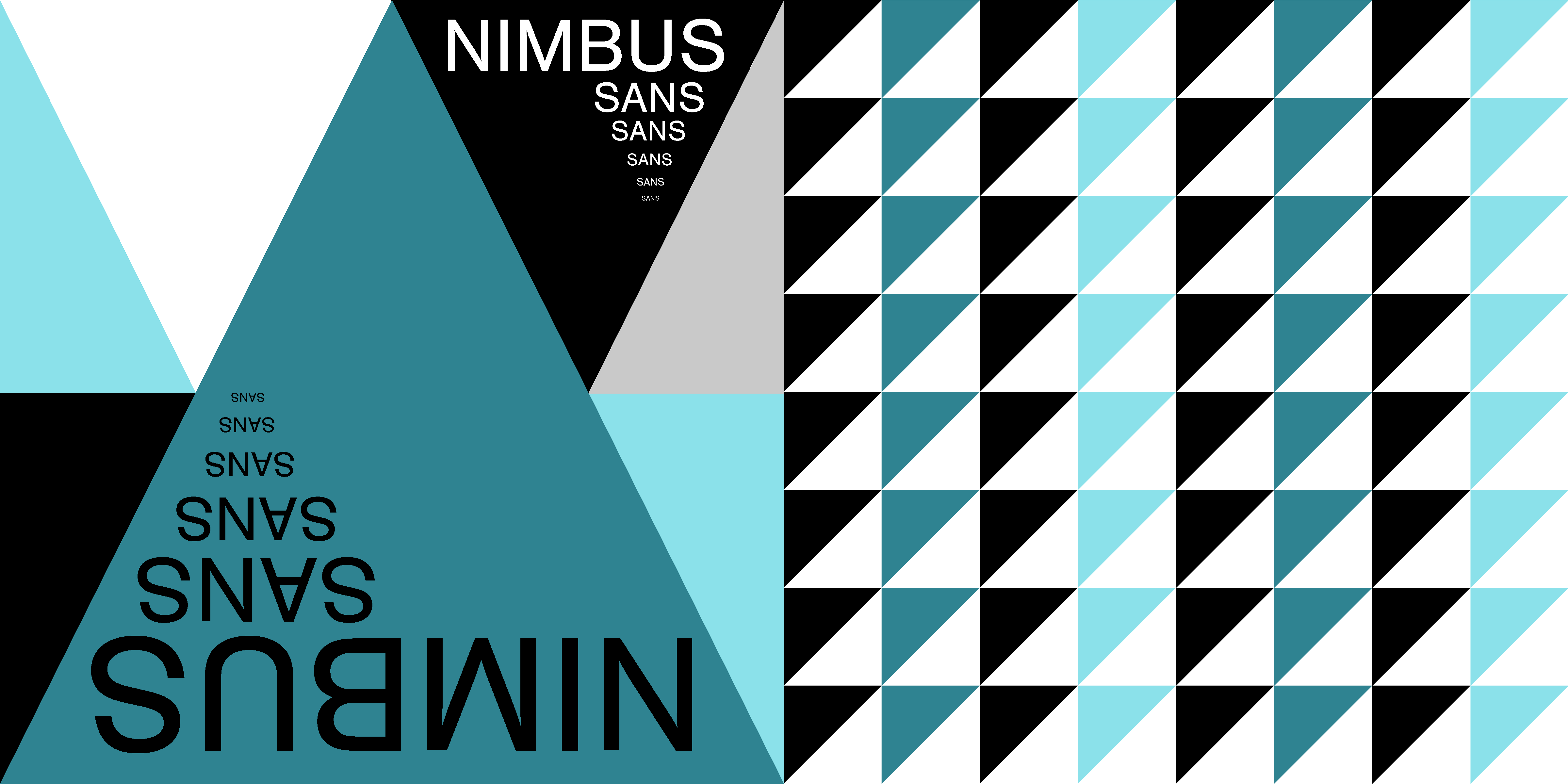
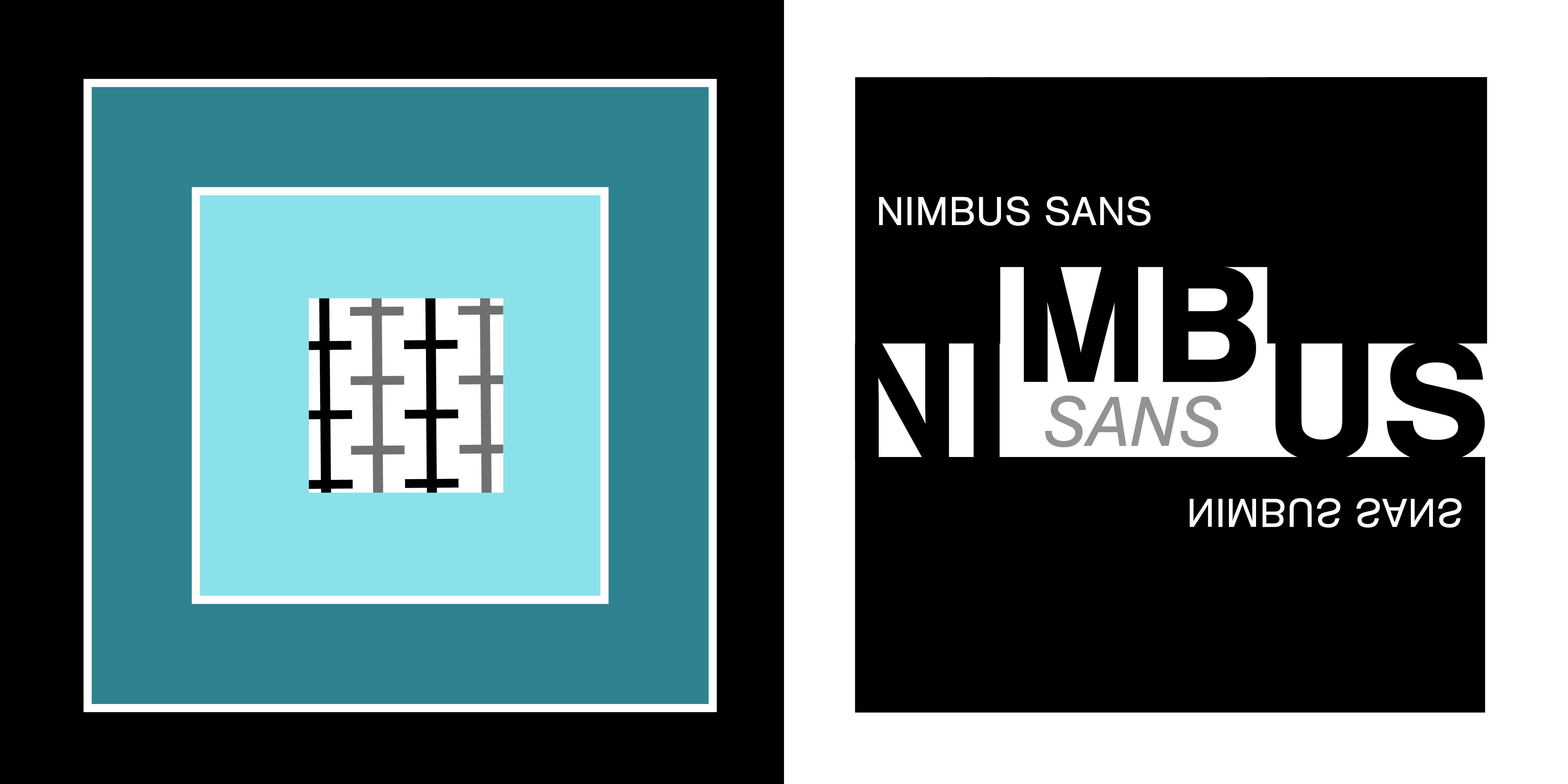
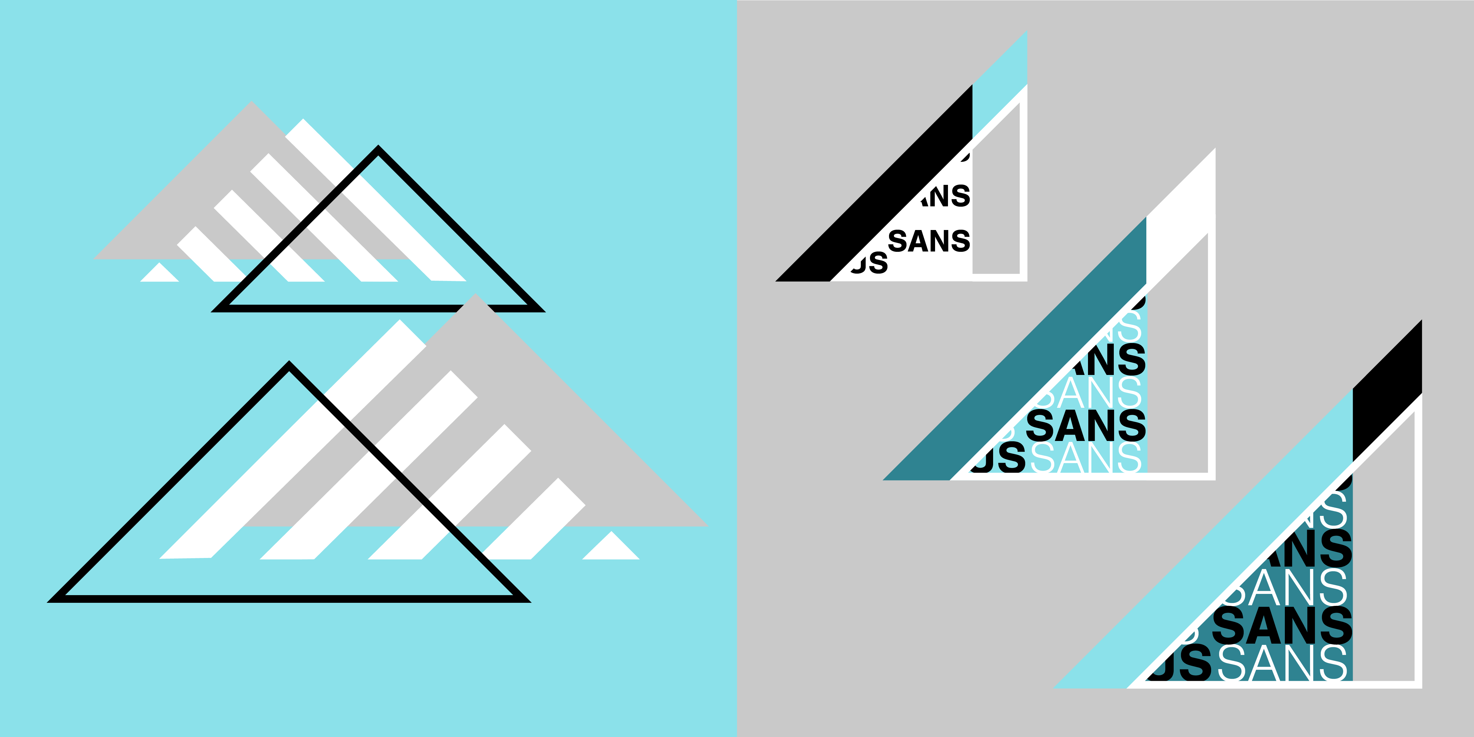
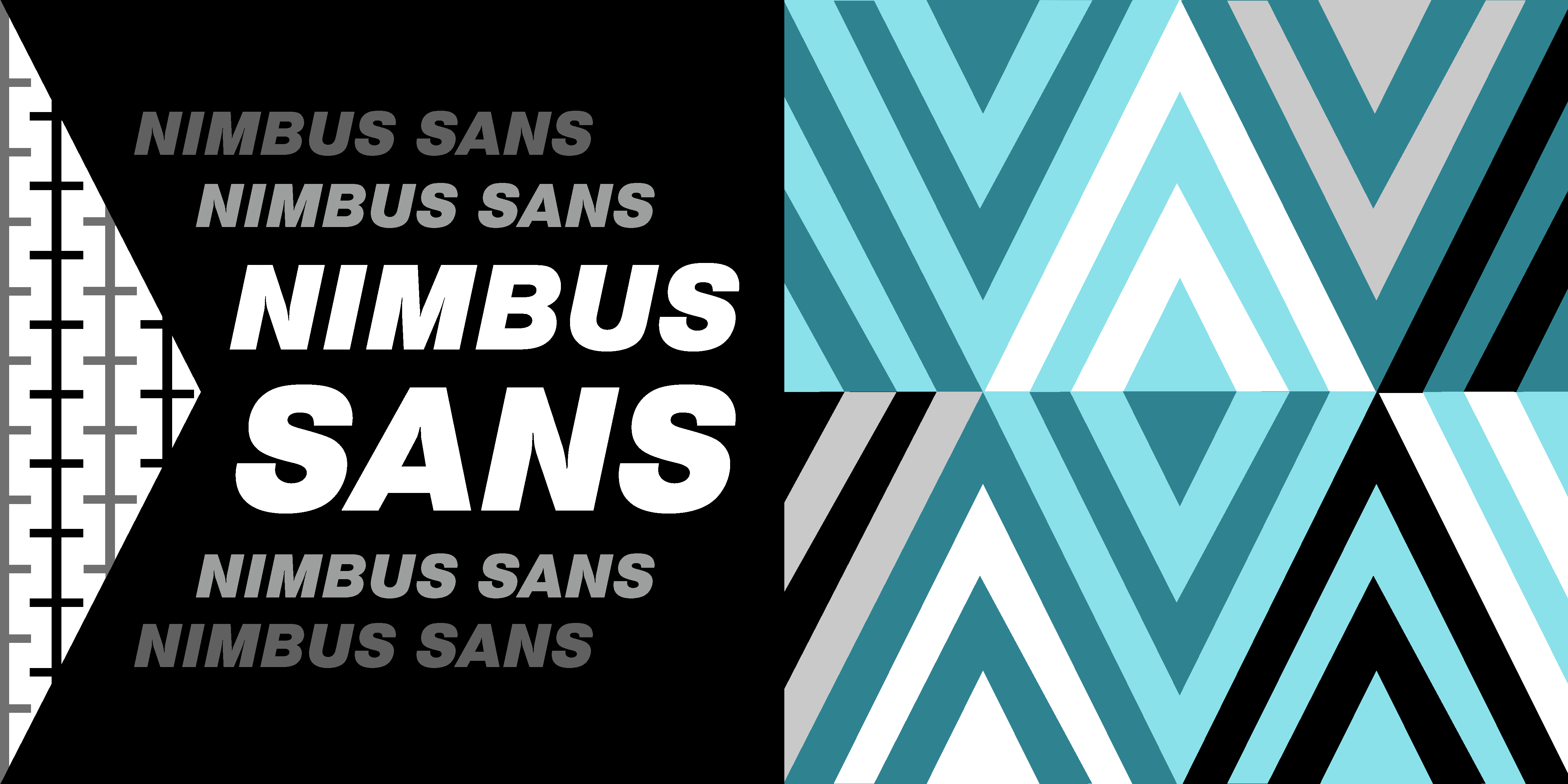
Visual Contrast Studies
Through direct juxtaposition, Visual Contrast Studies explores the six design principles of Scale, Weight, Texture, Form, Space, and Direction. Working within specific constraints (a limited color palette, basic geometric shapes, and utilizing predominantly bold sans-serif Nimbus Sans text), the book challenges conventional norms and encourages viewers to engage with the works in new ways, either individually or in conjunction with the adjacent pieces.
Applications
- Adobe Illustrator
- Adobe Indesign
Applications
- Adobe Illustrator
- Adobe Indesign
Flip Through
Flip
Through
Front & Back Cover
Flyleaf & Title Sheet
pg. 1

pg. 2

pg. 3
pg. 4

pg. 5

pg. 6

pg. 7

pg. 8
pg. 9
pg. 10

pg. 11 & Flyleaf
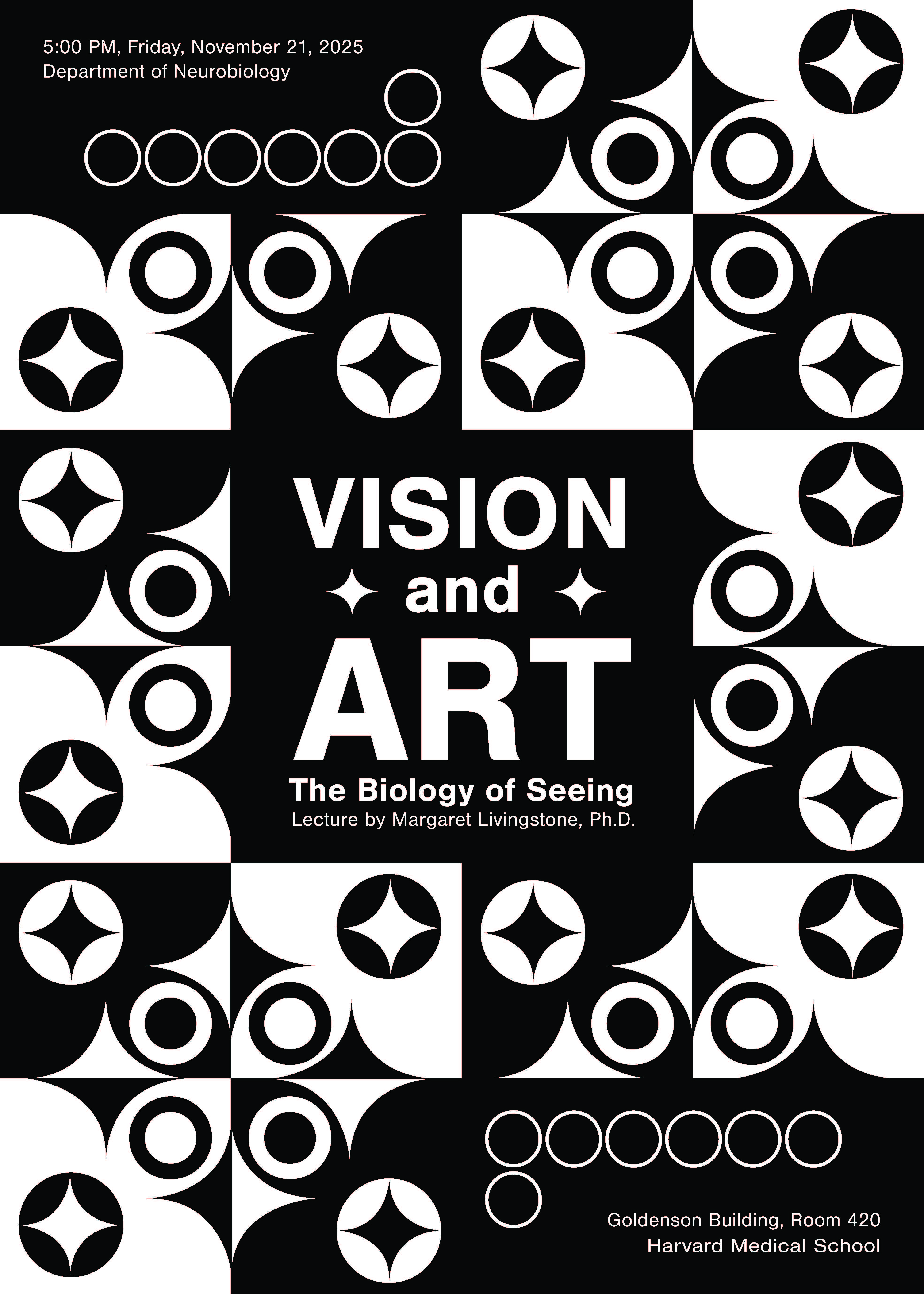
Gestalt Poster
This poster employs the Gestalt principle of figure-ground, creating a dynamic interplay between foreground and background elements. The stark black-and-white color palette emphasizes contrast between the varying design elements, while the white-on-black text treatment leverages visual weight to establish a clear hierarchy, drawing the eye immediately to the center.
Applications
- Photoshop
- Google Docs
Applications
- Adobe Illustrator
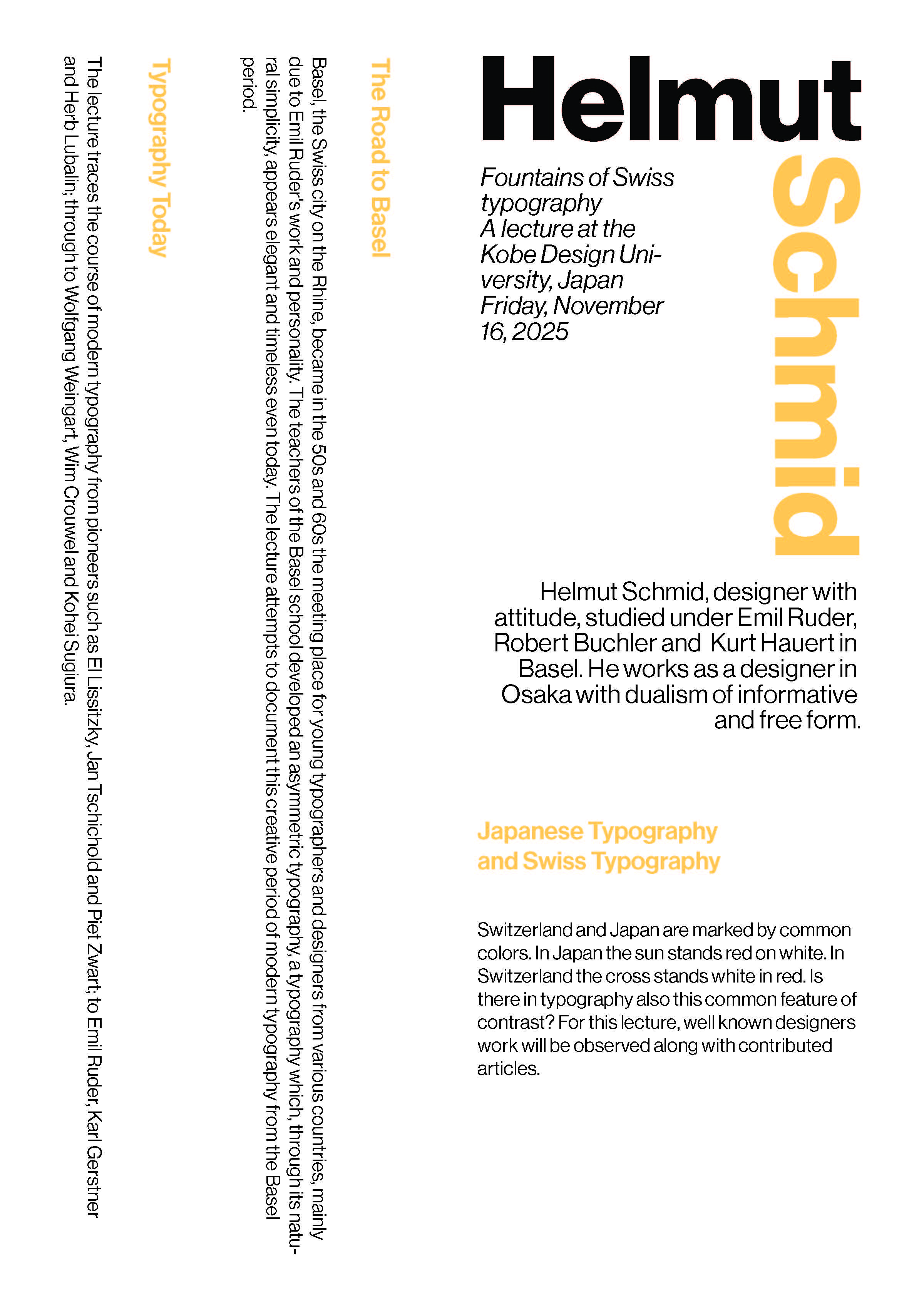
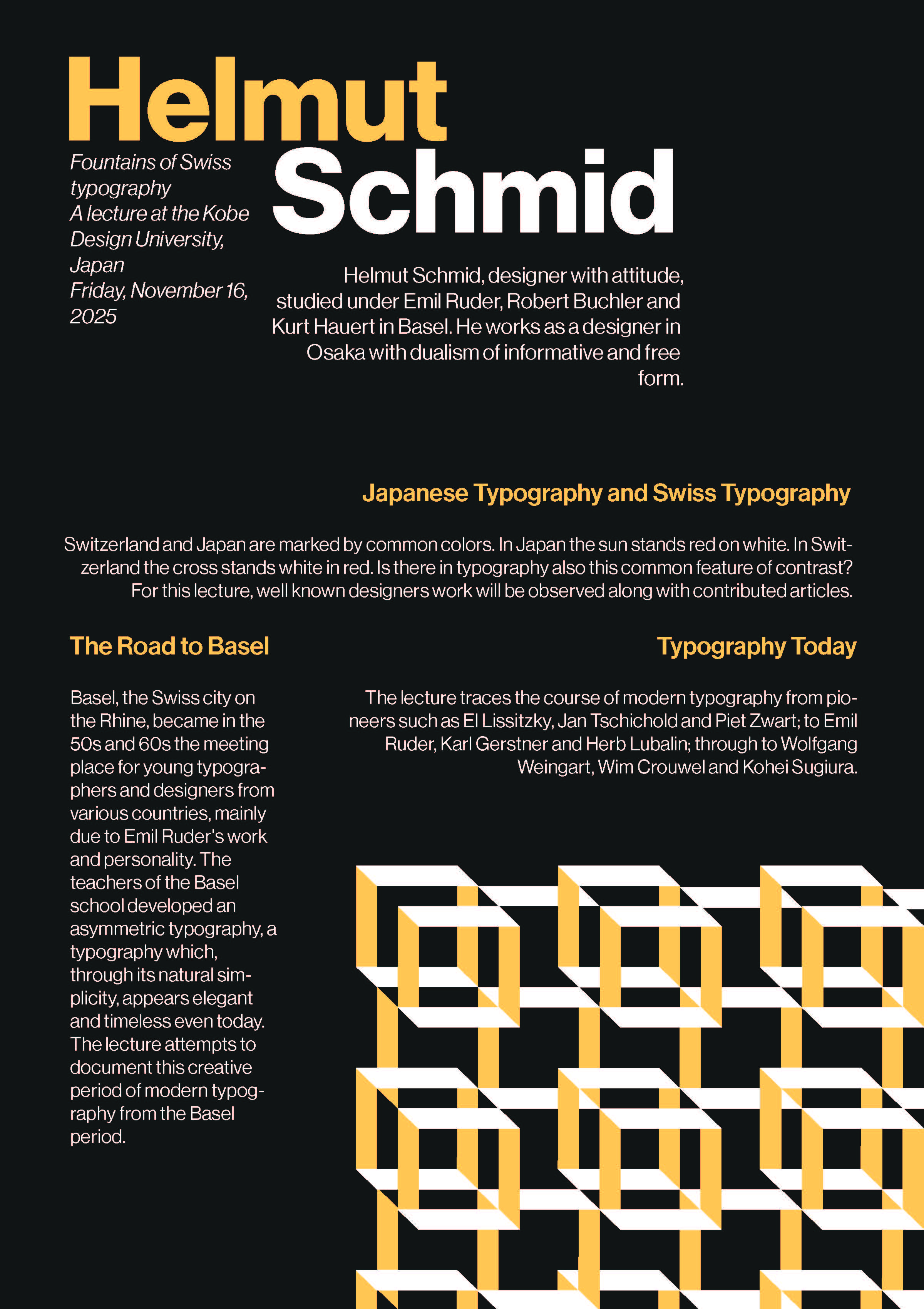
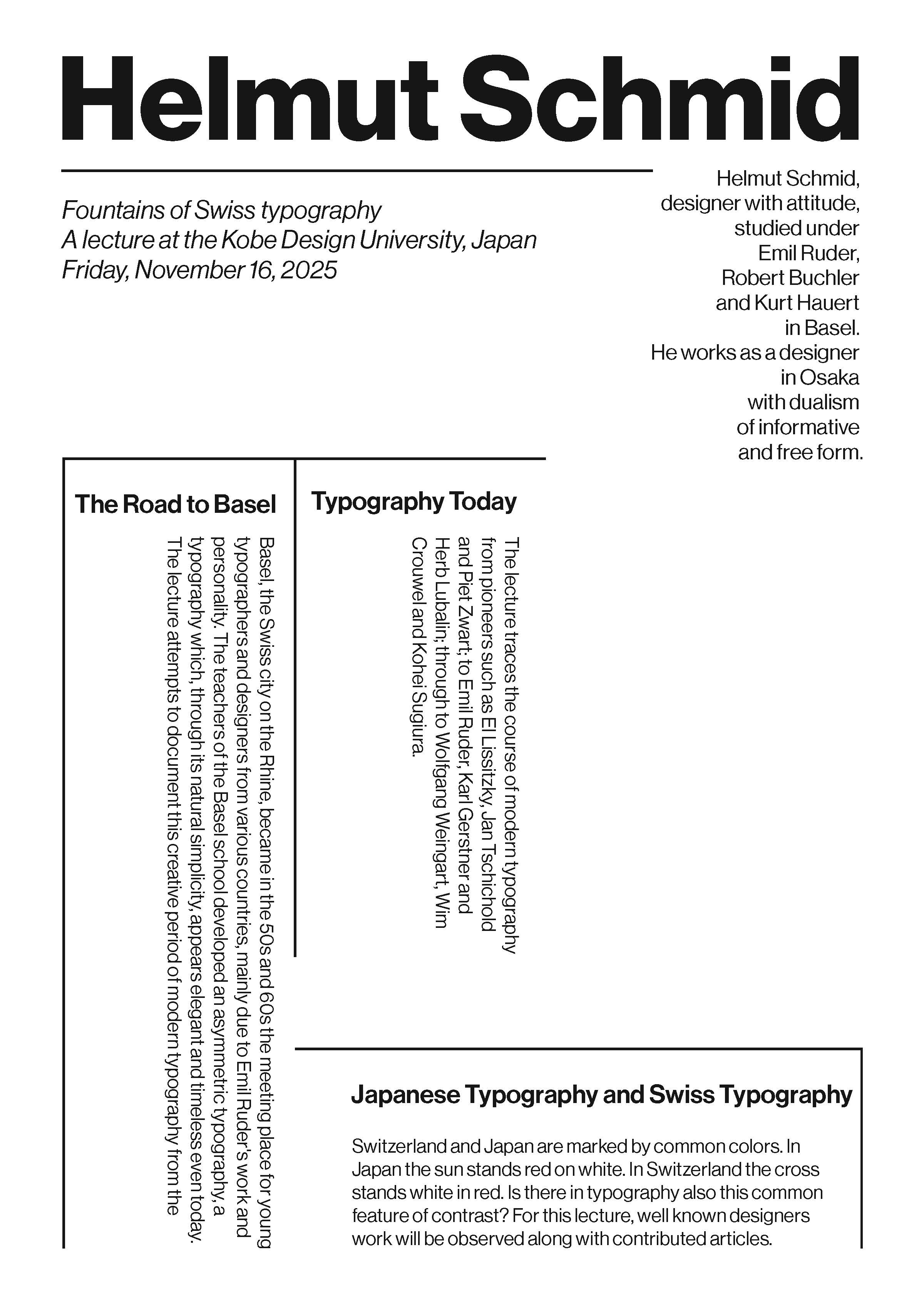
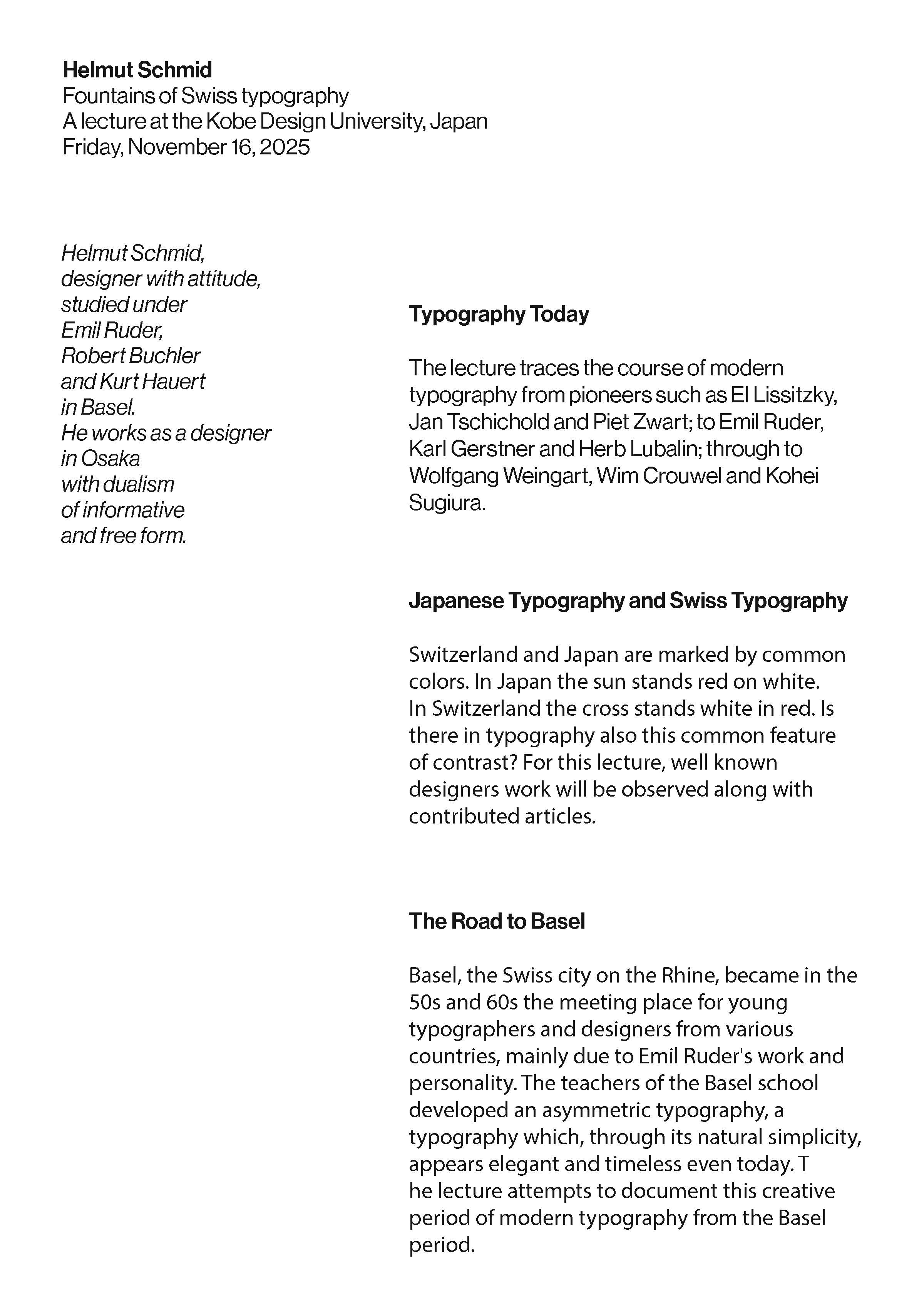
Helmut Schmid Posters
These four posters utilize Helmut Schmid’s design methodology, emphasizing his systematic approach to organizing information through grids, consistency, hierarchy, and typographic systems. Each employs Schmid’s clean, minimal aesthetic through compelling typographic layouts, with select posters introducing yellow accents to enhance visual interest while maintaining fidelity to Schmid’s design principles.
Applications
- Photoshop
- Google Docs
Applications
- Adobe Illustrator

Front
Back
Back
Applications
- Adobe Illustrator
- Adobe Photoshop
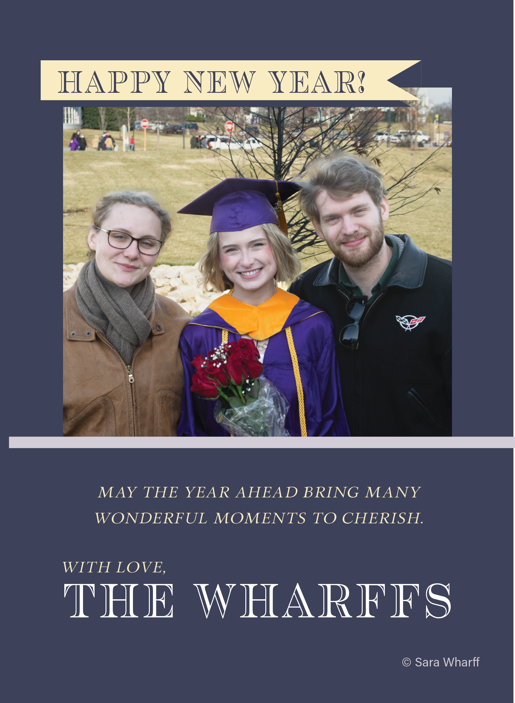
New Years Card
I designed this family holiday card to welcome the new year and celebrate milestones and transitions. The front features an effervescent champagne glass with one bubble encapsulating our family photo from my graduation. The card’s purple and gold palette subtly mirrors my graduation gown, linking two celebratory moments: academic achievement and new beginnings.
Applications
- Adobe Illustrator
- Adobe Photoshop

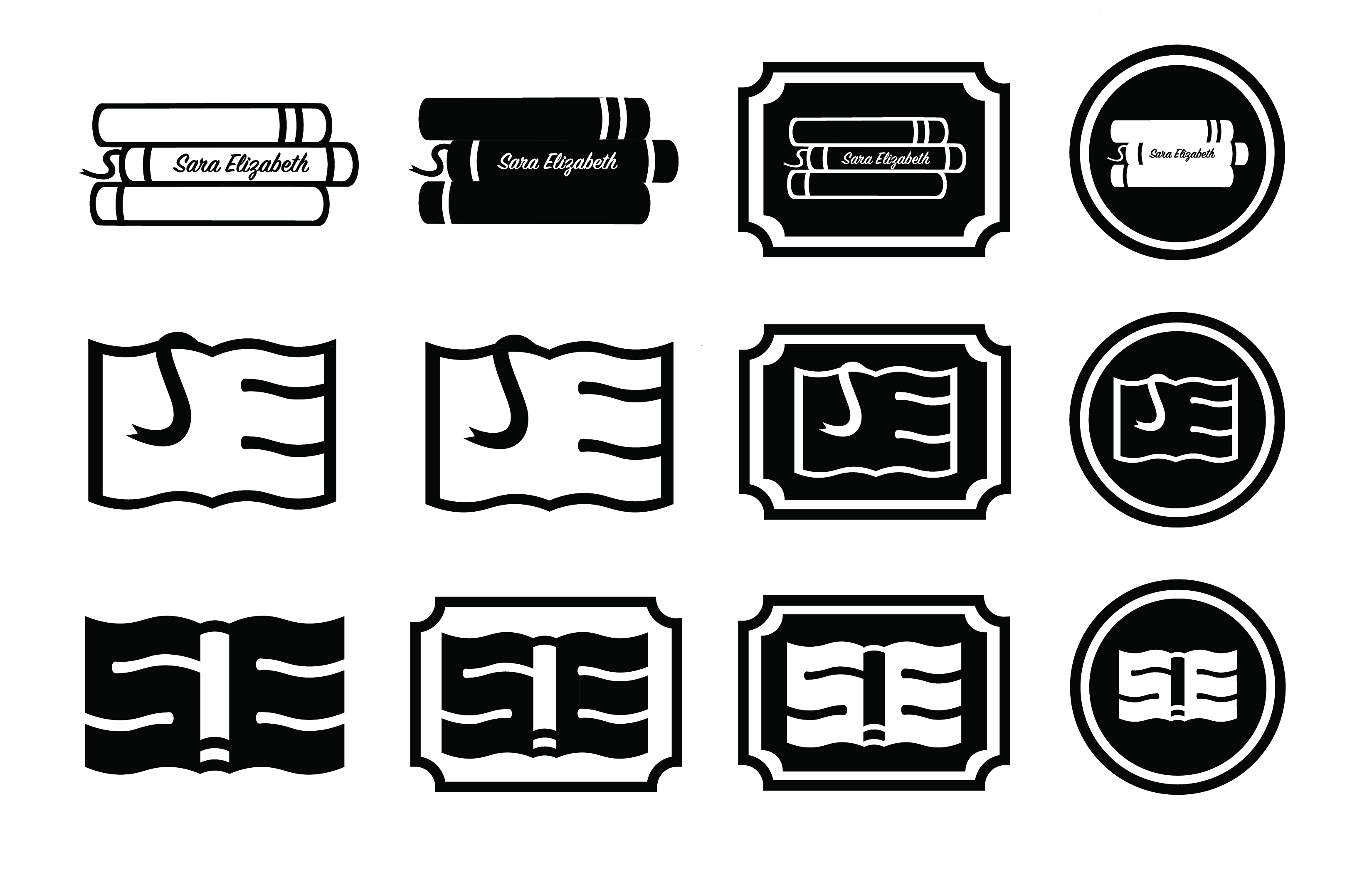
Brand Logo
The Sara Elizabeth logo reflects my passion for reading through interconnecting an S and an E to form an open book. The logo immediately conveys my brand’s literary identity to audiences, while its abstract quality ensures versatility across applications. Below, merchandising mock-ups demonstrate real-world usage alongside the initial logo treatment, featuring design drafts.
Applications
- Adobe Illustrator
- Adobe Photoshop
Applications
- Adobe Illustrator
- Adobe Photoshop
Merch MockUps
&
Drafts